Good Food Partners
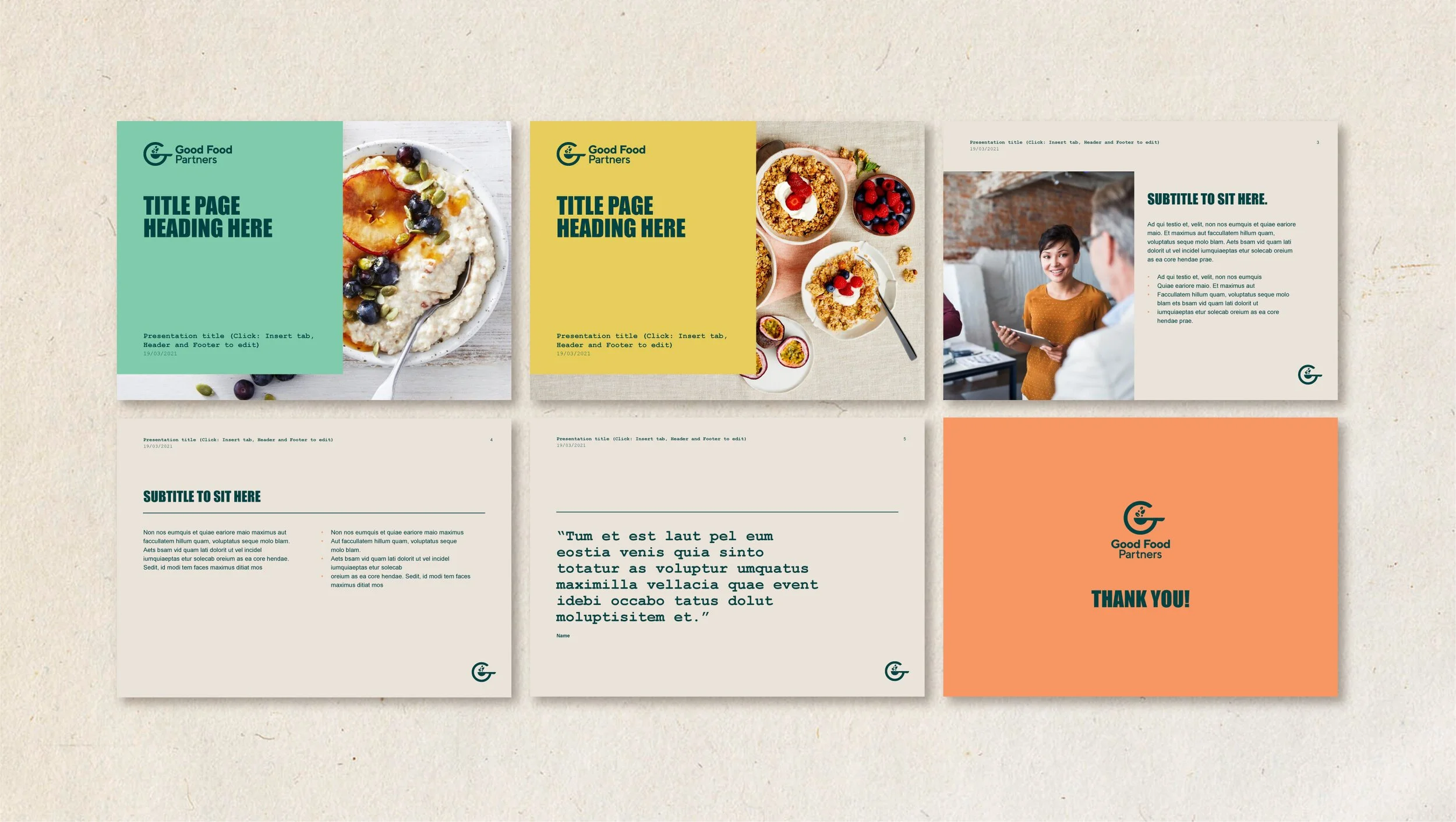
Good Food Partners recently decided to develop a new corporate brand that told a bigger, more engaging and more contemporary story about innovative food partnerships delivering really good food.
The new logo is a visual depiction of great, food partnerships - bringing to together the ‘G’ for ‘Good’ with quality ingredients and utensils, to form the subtle hint of a satisfied smile. An edible colour palette sets the brand apart in a very primary colour-dominant category, signalling warmth and welcome as well as modernity and innovation. A textured stamp approach to iconography combines with ‘on-site’, ‘ingredient’ and ‘partnership’ imagery to complete the visual toolkit.
The overall effect is one of quality and inventiveness, but with good people and good food at the heart.
To discover more about Good Food Partners visit goodfoodpartners.com.au


