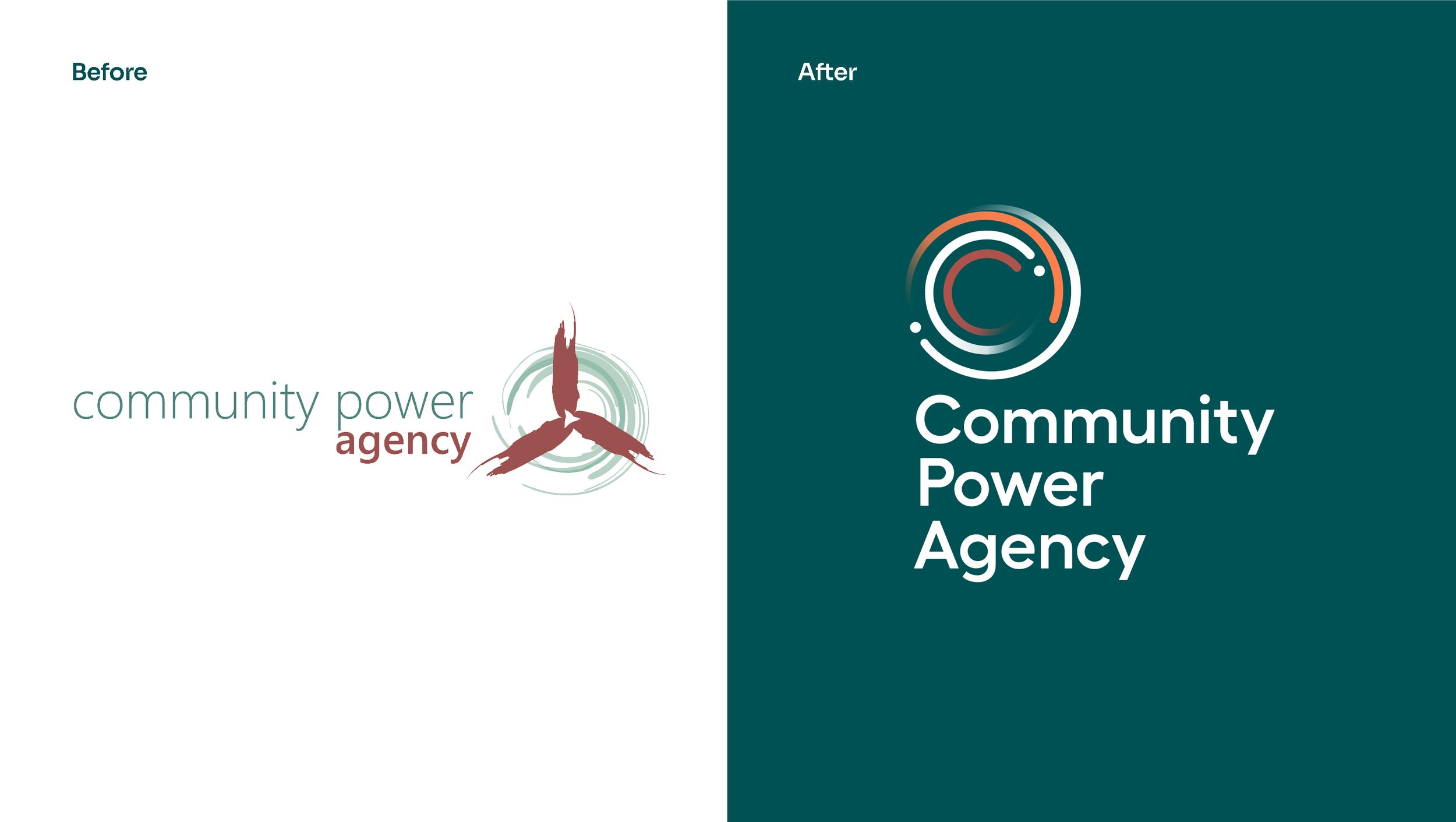
Community Power Agency
Community Power Agency (CPA) is an organisation that builds and shares knowledge to drive fair, accessible and smooth renewable energy transitions with community benefit at their core. We worked with CPA to deliver their new brand story and a visual identity refresh, balancing community-centric warmth with dynamic innovation and expertise.
The logo features a circular symbol composed of tapered lines and dots, representing dynamic energy and progress. These elements come together to form a cohesive and dynamic whole, symbolic of collaboration between communities, industry and government. These lines and dots also create a graphic language for communicating stats and scientific information in an engaging way. The colour palette combines rich natural tones, evoking Australia’s natural resources and landscape, with bright violet to represent energy and innovation. Tonally-aligned photography brings the story of community-centric transition to life, ensuring people are featured in every image.
The new identity and brand story communicates CPA’s focus on placing community benefit at the heart of Australia’s renewable energy transition, preparing the organisation for their future of leadership and action.