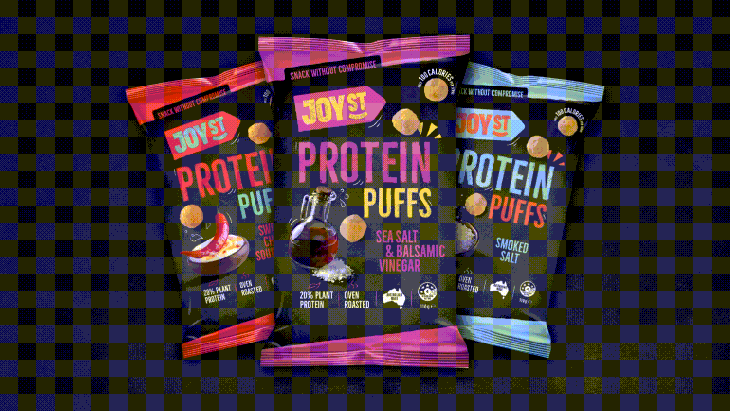
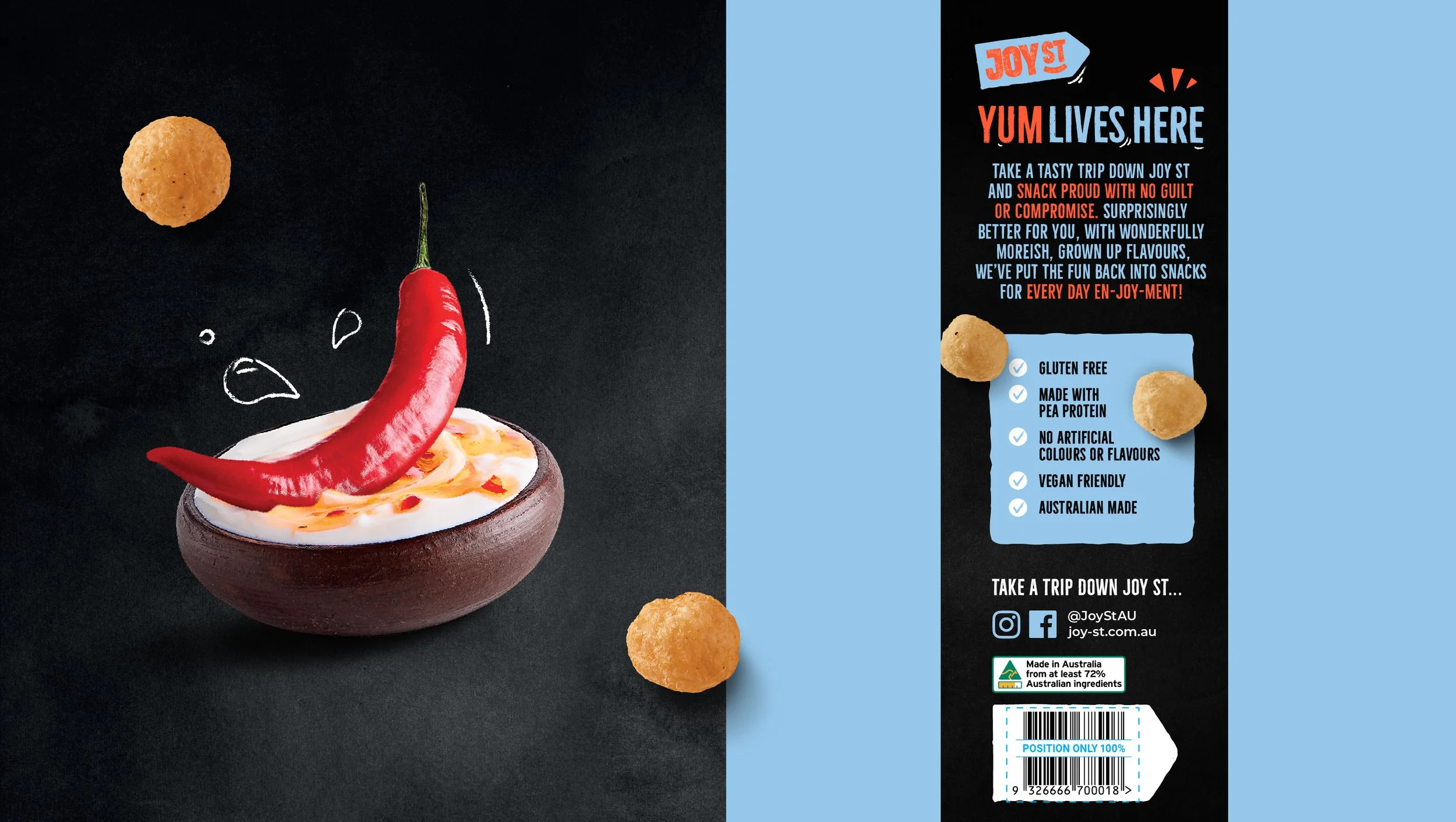
Joy St Packaging
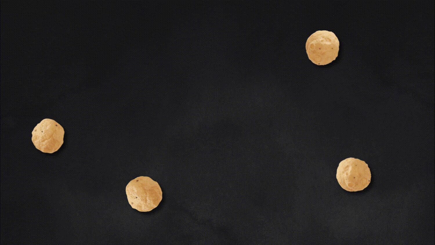
The team at Good Food Partners has been developing ‘better for you’ products for over 18 years. Building on this reputation and expertise, and aligned to growing awareness of the benefits of protein in a healthy diet, they launched Joy St to make protein more accessible. These moreish protein puffs come in a range of adult-friendly flavours, and, at only 100 calories per serve, are a snack without compromise.
We wanted the brand to feel like a destination rather than just a product, so we developed a street sign logo that welcomes consumers to the Joy St community and experience. A consistent, chalkboard-style background ties the range together, while fun, vibrant colour combinations - for the logo, illustration and claims - communicate variant, draw attention and help Joy St to stand out in the category; whether ranged in the health or snacking aisles. The dynamic photography creates movement on the pack, adding to the brand's joyful personality.